
Now that I have books to sell in more than one format, I need to erect some machinery to drive sales to more than one retailer. Time was, when all my books were conventionally published print books, a simple link to each book’s Amazon page was enough. Now I have a conventional print book, several POD print books, and ebooks in two formats.
The Copperwood Press catalog page needs a total rewrite, and I’ve been working on that. (It’s one reason I’ve been a little bit scarce here.) One thing I did do today is mount a generic WordPress HTML window in the wide sidebar, and then fill it with thumbnails of all my books. The thumbnails will eventually be clickable links into the catalog, from which you will be able to choose your format and jump to a retailer. (I will not be mounting a cart myself; it’s far too much kafeuther if Amazon and B&N will both give me 70% margins on my $2.99 ebooks.) If you’re reading Contra on my WordPress site, look to your right to see the thumbnails. If you’re reading Contra on LiveJournal, go here.
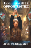
When you do, you’ll understand the conclusion I came to earlier today: My covers are not very thumbnailable. Some work better than others, and you can only do much with an image that’s 115 pixels high. I’m not an artist but I do know layout. The problem is that I learned it under the assumption that the purchaser would make his or her decision based on a much larger view of the cover, including true face time at bookstores.
With ebooks the cover game changes radically, and it’s all about thumbnails. Here’s an intriguing article on the issues associated with cover design for ebooks. When all you get is 90 pixels, it’s tough to do flourish. The best you can hope for is legibility for the title. (Interestingly, Amazon seems to have bumped search results thumbnails up to 115 pixels in the six months since Joel posted his essay. Cold comfort.)
 As I explained in my May 19 post, I’ve done well so far because I’ve published the sorts of books that people search for by name, as with Carl & Jerry. But if Cold Hands and Other Stories (now available on Kindle) is being browsed in the very big bin labeled “Hard SF,” the thumbnail cover image has a crucial selling job: getting above the noise represented by everybody else’s 115-pixel search results thumbnails.
Clearly, I have some work to do. What you see to the right are 165-pixel thumbnails, which are one and a half times the size of what the readers see in search results listings. The little Cold Hands cover above is 115 pixels high, and the more pixels you have on your screen, the smaller it looks. I’ve already done some surgery on the cover for Jim’s On Gossamer Wings, and I think I may well just start over with “Whale Meat.”
It’s hard to avoid the conclusion that covers are becoming icons. Alas, the job of an icon is precisely the opposite of the job of a cover thumbnail: An icon stands in for something that we’re already familiar with and see constantly. A cover thumbnail stands in for something that we’ve never seen before. Worse, covers are becoming icons that must contain readable words. Of all the examples shown by Joel Friedlander in his article linked above, only Christopher Smith’s Fifth Avenue really works at 90 pixels. It works because there’s almost no image involved. You get a little color, and a tiny black stick that could be just about anything. (If I didn’t know where “Fifth Avenue” was, I might not have guessed a skyscraper.)
I’m not entirely sure what to think about the problem. If cover images get too small, they carry too little information to be useful. We can read the title in text beside the thumbnail; do we need to be able to read it in the thumbnail too? Will people get so used to minuscule cover thumbnails over time that they’ll basically stop noticing them?
Subtlety and beauty have not always been the domain of book covers. Maybe this is yet another indication that we’re returning to the pulps: Our covers may need to become very small collections of iconic symbols (bug-eyed monsters, V-2 spaceships, traffic-cone breasts, ray guns) to be recognizable as anything at all.
I’m not sure that worked for the pulps. I’m even less sure it will work for us. The real bummer is that I’m not sure what else to suggest.


I heartily recommend the Assembly Language Step-by-Step book. I’ve purchased all three editions, and I’ll probably by a ePub version (preferably Kindle) when it comes out.
p.s., I’m interviewing for a position at Amazon today – Kindle team. The ePub industry is definitely a growing one. I imagine a lot of author’s are going through similar pains!
Shazam! You have your choice!
Kindle: http://www.amazon.com/Assembly-Language-Step—Step-ebook/dp/B004QWZXFA/
EPub: http://search.barnesandnoble.com/Assembly-Language-Step-by-Step/Jeff-Duntemann/e/9781118080993/
It’s tough doing a technical book in a reflowable format (especially with code snippets and many largish technical figures) but they did about as good a job as is possible with the material.
Good luck in your new job and thanks for the vote of confidence. I appreciate it!
Jeff: Also it points to the title of books becoming shorter, because short titles are easier to typecast in a large block sans-serif font, which then are more visible in thumbnail form. No longer “Tess of the d’Urbervilles” but “TESS”. Possibly with an exclamation mark.
Cheers, Julian
The flip side of the whole text-too-small thing is that striking artwork pops out more. Looking at the sample thumbnails, I’d say Assembly Language Step by Step is the weakest cover, because it is not visually eye catching in small scale. I think covers with bright color art work well, and yeah, title text needs to be goodly sized and in a contrasting color.
Far from starting over with Whale Meat, I’d go with a denser typeface on that one and call it done.
Recall also that the text on the cover is not the only identifying info of the book. Searching for “Jeff Duntemann” on Amazon, I get not a block of unidentifiable icons, but a thumbnail, then human/machine readable text/ then another thumbnail, and so on. In places like my website’s Goodreads feed, people looking over that have likely seen whatever covers they’re clicking on before, so it functions as an icon there.
-JRS
The case of the shrinking thumbnail reminds me of the case of the shrinking TV theme song/title sequence These used to be 90 seconds; then 60… Stargate Atlantis eventually went to just two bars of music in six seconds and SG:U is maybe a second and a half. Granted that these are very much niche shows and everyone watching already knew what the shows were about; still, this is an aspect of the art that is disappearing.